
Where did my beer go? A lesson in packaging
- gwight7
- Aug 4, 2022
- 3 min read
Updated: May 13, 2025
In the past year, my three favourite IPA beer brands have changed packaging. On each occasion, I could not find what I was looking for and figured the product was no longer carried where I shopped. When we shop, we make most of our decisions subconsciously. We look for learned images of products we know, and we shop like this to minimize the amount of time we must consciously think. In my case, I learned to look for the three images below to shop.
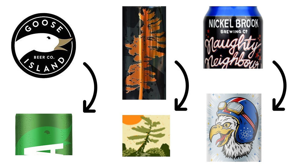
For Goose Island, I always looked for the black circle with the white goose logo (top left). For Lone Pine (middle), I look for the idyllic orange pine tree, and for Naughty Neighbour I learned to look for the horizontal blue band at the top of the can and right below it the cursive writing of the brand name with the black background.
In each of these cases, the main anchor point for me was removed from the package. I stood for several minutes looking in the very busy section for the visual cues in my long-term memory and nothing matched. That’s when I figured the brand was no longer carried at my local store.
You could be saying, “but he’s just one shopper. Certainly, most people would be able to make the conversion more easily that this one shopper’s experience”. The packaging analysis below from DragonflyAI helps to identify which packaging attributes are seen by the subconscious in the first 1 to 1.5 seconds of viewing an image.
Goose Island IPA:

In this packaging assessment, Goose Island has a 75% Attention score on the circular logo at the bottom left (note - Attention score measures the probability of perception which defines the % of consumers engaging with the content - in this case the round Goose logo >> 75% will "see" the defined area of interest) . On the right, the Goose visual is designed to be in the background with an Attention score of 47%. In addition, the “GOOSE” wording at the top (left) was not transitioned to the new package (right). My visual Shopping cues were gone.
Lone Pine IPA:

The iconic orange pine tree has an Attention score of 93% (left). It is the visual strike point for the package. In the new packaging the Attention score is 49%, the pine tree colour is now green, and the previously key visual - the pine tree - is now a small part of a much larger visual including a rocky shoreline. While I am sure this was on brief, it made it challenging for me, the Shopper, to find what I was looking for. (More on how to create a brief with the Shopper in mind below)
Naughty Neighbour IPA:
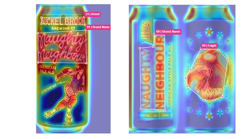
Naughty Neighbour’s Brand Name Attention score is 91% on its old package. While the new packaging scores have strong Attention scores as well (69% for Brand Name & 84% for the Eagle), both images represent new stimuli that the Naughty Neighbour Shopper has not seen before. It is proven that when Shoppers see stimuli they do not know, they subconsciously ignore it and look for visuals they are familiar with.
In each of the three cases above the “owned” packaging attribute has either dramatically decreased the Brand’s ability to attract the attention of its current Shoppers, or the owned visuals have been completely removed from the package.
Why is this?
REMEMBER THE SHOPPER WHEN CREATING PACKAGING BRIEFS FOR YOUR CREATIVE PARTNERS
The challenge lies in how Packaging Briefs are written. Most Brands will write a consumer-focused brief for a creative team which then develop several options before the client decides on the winning design. The end deliverable is “on brief”. Except one critical thing was missed – Shopper insights were not included in the original brief. In many cases, the visual cues the brand has developed over years - that act as Shopper signposts - have been removed from the package.
All three products I mention above are great IPA’s, and while I left each of the brands for a period of time during the packaging change, I did learn that they were in fact still available in my area. The IPA beer category – and many others – are very fragmented and difficult for a product to stand out. Make sure you understand what packaging attributes you own with your Shopper. If you do not consider this as you prepare for your next packaging initiative, you could be inadvertently losing built-up Shopper equity in your brand as you work on refreshing your packaging.


Comments